Maximizing Conversion Rates: 7 UX Principles That Drive Sales
Learn how subtle design changes can significantly impact your bottom line. We explore the psychology of user experience and high-converting layouts.
Small Design Changes, Big Revenue Impact
Conversion rate optimization isn't about massive redesigns or expensive tools. Often, the biggest improvements come from understanding how people think and designing your website to align with natural human behavior. A button color change, a headline rewrite, or a simplified form can lift conversions by 20-30%.
These seven UX principles are backed by research in cognitive psychology and behavioral economics. They're the same principles used by the world's highest-converting websites, and they work for businesses of any size.
1. Reduce Cognitive Load
Every decision you ask a visitor to make drains their mental energy. The more options, fields, and choices you present, the more likely they are to do nothing. This is known as the paradox of choice, too many options lead to decision paralysis.
Simplify your pages. Limit navigation options to the essentials. Reduce form fields to the absolute minimum required. Present one clear call-to-action per section instead of competing buttons. The easier you make it to take action, the more people will take action.
2. Use Visual Hierarchy to Guide Attention
Users don't read web pages, they scan them in an F-shaped pattern. Your most important content needs to be positioned where eyes naturally land: top-left, headings, and the beginning of paragraphs.
Use size, color, contrast, and whitespace to create a clear hierarchy. Your headline should be the largest text on the page. Your primary CTA should be the most visually prominent element. Secondary information should be visually subordinate. When everything is bold and attention-grabbing, nothing is.
3. Build Trust Above the Fold
Visitors decide within seconds whether they trust your website. Place trust signals, client logos, review ratings, security badges, certifications, in the first viewport they see. Don't bury your social proof at the bottom of the page where only committed visitors will scroll.
For service businesses, showing a real photo of your team, a physical address, and a phone number above the fold immediately humanizes your brand. Anonymous, faceless websites trigger skepticism.
4. Create Urgency Without Being Pushy
Authentic urgency motivates action. Limited-time offers, seasonal availability, and genuine scarcity ("only 3 spots left this month") give visitors a reason to act now instead of bookmarking your page and forgetting about it.
The key word is authentic. Fake countdown timers and manufactured scarcity erode trust. If every visitor sees "only 2 left!" for months on end, your credibility suffers. Use urgency honestly, and it becomes one of your most powerful conversion tools.
5. Optimize Your Forms
Forms are where conversions happen, and where they die. Every additional field reduces completion rates by approximately 11%. Ask only for the information you absolutely need at the point of conversion. You can always collect more details later.
Use smart defaults, autofill-friendly field names, inline validation (show errors as they type, not after they submit), and progress indicators for multi-step forms. Make sure the submit button text is specific, "Get My Free Quote" converts better than "Submit."
6. Use Social Proof Strategically
Humans are social creatures. We look to others' behavior to guide our own decisions, especially when we're uncertain. Testimonials, case studies, review counts, and "trusted by" logos all serve as social proof that reduces the perceived risk of doing business with you.
The most effective social proof is specific and relevant. "Web Liftz helped us increase online leads by 340%" is far more convincing than "Great service!" Place testimonials near decision points, next to pricing, near CTAs, and on checkout pages.
7. Speed Is a Feature
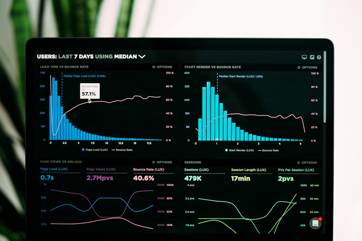
We covered this in detail in our page speed article, but it bears repeating in the context of conversions. Every second of load time reduces conversions by 7%. A fast website doesn't just rank better, it converts better because visitors aren't losing patience waiting for your page to render.
Audit your Core Web Vitals, optimize your images, minimize your JavaScript, and choose hosting infrastructure that delivers fast response times. Speed improvements are often the highest-ROI changes you can make to your website.
Anas designs, builds, and optimizes every website Web Liftz ships. He writes from what actually works across client projects in Orange County: local SEO, conversion-focused design, and fast websites that rank. More about the studio.
Ready to Elevate Your Online Presence?
Let's talk about your project. Get a free consultation and custom quote within 24 hours.